Flex-Box
In this article we are going to understand about flexbox in brief.


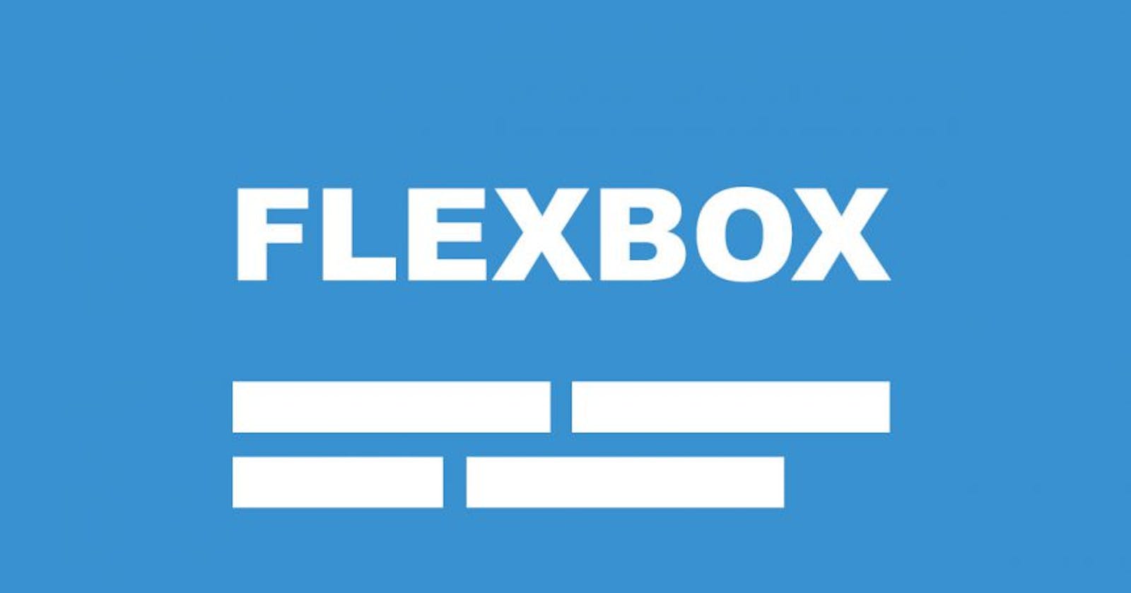
Table of contents
First mainly flex-box is a CSS element.
Flex-box is a one-dimensional layout method for arranging items in rows or columns.
flex expand to fill additional space or shrink to fit into smaller spaces.
In flex-box it provides a property called flex-direction that specifies which direction the main axis runs and by default, it is set into a row.
Without Flex
When we use it without flex we can see the output below:
<!DOCTYPE html>
<html lang="en">
<head>
  <meta charset="UTF-8">
  <meta http-equiv="X-UA-Compatible" content="IE=edge">
  <meta name="viewport" content="width=device-width, initial-scale=1.0">
  <title>FLEX</title>
  <link rel="stylesheet" href="style.css">
</head>
<body>
  <div>
  <p class="one">1</p>
  <p class="two">2</p>
  <p class="three">3</p>
</div>
</body>
</html>
The Above code is HTML code for executing flex.
body{
    background-color: lightblue;
}
div{
     /* display: flex; */
}
.one{
    height: 150px;
    width: 150px;
    border: 1px solid red;
    background-image: url(kohli.jpg);
    background-size: 100%;
    margin-right: 10px;
}
.two{
    height: 150px;
    width: 150px;
    border: 1px solid red;
    background-color: blueviolet;
    margin-right: 10px;
}
.three{
    height: 150px;
    width: 150px;
    border: 1px solid red;
    background-color: aquamarine;
    margin-right: 10px;
}
This was CSS code and below you can see the output without flex:
OUTPUT:
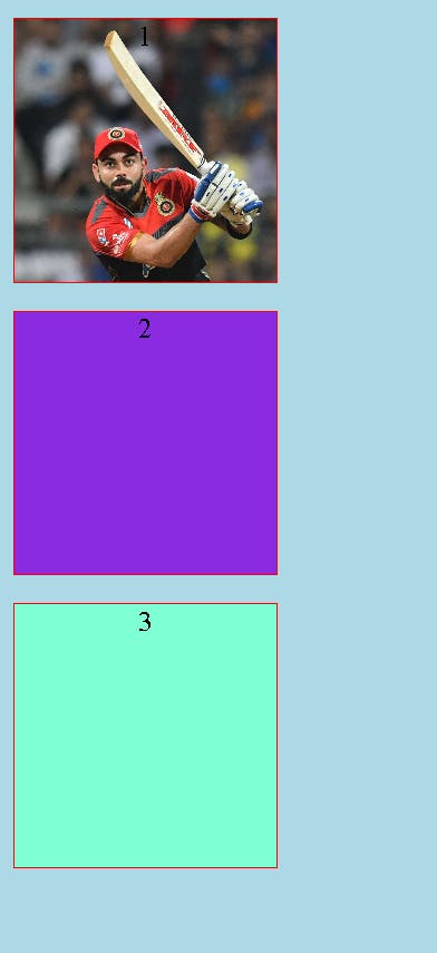
With Flex
The HTML code is the same for that and just we include display flex in CSS.
body{
    background-color: lightblue;
    text-align: center;
}
div{
     display: flex;
}
.one{
    height: 150px;
    width: 150px;
    border: 1px solid red;
    background-image: url(kohli.jpg);
    background-size: 100%;
   margin-right: 10px;
}
.two{
    height: 150px;
    width: 150px;
    border: 1px solid red;
    background-color: blueviolet;
    margin-right: 10px;
}
.three{
    height: 150px;
    width: 150px;
    border: 1px solid red;
    background-color: aquamarine;
    margin-right: 10px;
}
OUTPUT:
there is also one method of the wrapping when we fix some height and width in our layout then some of our element overflow the assigned dimensions, by wrapping we can set it along our mentioned dimensions.
For that first, we use the display as flex then in the next step we use flex-wrap.
flex properties :
Flex-start: It is the default value, which makes all the items sit at the start of the main axis.
Flex-end: we can use flex-end to sit them at the end.
justify-content: It is used for flex items that are placed at the center along the main axis.
space-around: It is used for flex items to have a space gap (space left) at both ends.
space-between: It is almost similar to space-around, but it will not leave space at both ends. only it leaves space between flex items.
flex directions:
Flex direction means the direction of flex items arranged as a row or a column. both row and column can be reversed using row-reverse and column-reverse properties.