

Table of contents
Gird
It is a set of horizontal and verticle lines of rows and columns, elements are placed with the lines of rows and columns.
Grid container
We can create a grid by declaring display: grid; in CSS on an element when we do this all children of the element became grid items.
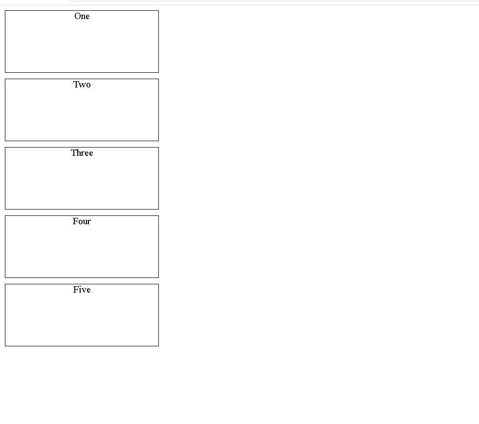
In the below code, you can see the section has a class of "somethingclass" it is the parent element and the remaining are childs of that section.
 <section class="Somethingclass">
      <div>One</div>
      <div>Two</div>
      <div>Three</div>
      <div>Four</div>
      <div>Five</div>
</section>
In this below code we set a container for all the divs and we assigned display as grid in the class for the section.
div{
    height: 200px;
    width: 250px;
    border: 1px solid black;
    margin-bottom: 10px;
}
.somethingclass{
    display: grid;
}
output:
Now you can see all the elements are grid items now we can use many properties to get the desired looks.
Grid Tracks
we have rows and columns in our grid with the grid-template-rows and grid-template-columns properties. these are the grid tracks, which give space between any two adjacent lines on the grid.
 <div class="container">
  <div class="items"></div>
  <div class="items"></div>
  <div class="items"></div>
  <div class="items"></div>
  <div class="items"></div>
  <div class="items"></div>
  <div class="items"></div>
  <div class="items"></div>
  <div class="items"></div>
  <div class="items"></div>
  <div class="items"></div>
  <div class="items"></div>
  <div class="items"></div>
  <div class="items"></div>
  <div class="items"></div>
  <div class="items"></div>
  <div class="items"></div>
  <div class="items"></div>
  <div class="items"></div>
  <div class="items"></div>
  <div class="items"></div>
  <div class="items"></div>
  <div class="items"></div>
  <div class="items"></div>
  <div class="items"></div>
  <div class="items"></div>
  <div class="items"></div>
  <div class="items"></div>
  <div class="items"></div>
  <div class="items"></div>
  <div class="items"></div>
  <div class="items"></div>
  <div class="items"></div>
  <div class="items"></div>
  <div class="items"></div>
  <div class="items"></div>
 </div>
*{
    margin: 0;
    padding: 0;
    border: 0;
    box-sizing: border-box;
}
body{
    min-height: 100vh;
}
.container{
    border: 3px solid red;
    min-height: 100vh;
    display: grid;
    grid-template-columns: 1fr 1fr 2fr 1fr 1fr 1fr;
    grid-template-rows: 1fr 2fr 1fr 1fr 1fr 1fr;
    column-gap: 8px;
    row-gap: 16px;
}
.items{
    border: 4px solid black;
}
Output:
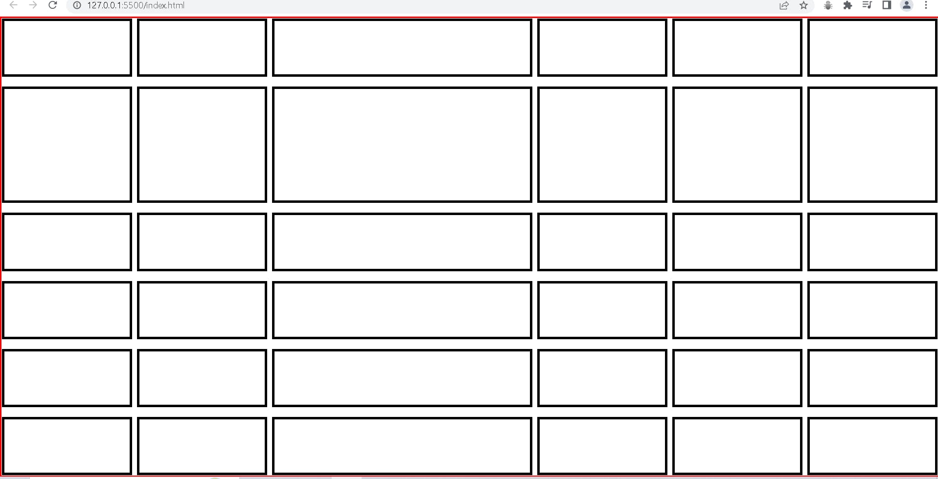
In this output, we can see the third column is wide because in grid-template-column I used the third column with 2 fractions of width and in the same way in grid-template-row I used 2nd row with 2 fractions, and in the column, you can see 8px of a gap because of I have been used column-gap 8px in the same way I used row-gap of 16px.